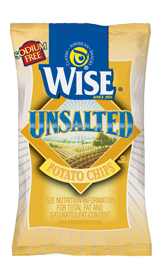
Wise are one of the biggest and most established Chips companies in the world. Their bag designs will understandably have a bit of a corporate feel. The flavors are color coded, with nice shaded areas to compliment the colors. The Wise logo has shrunk and altered over the years but it is highly visible, recognisable and very well designed. The rotated square is original and not copied. Despite their massive resources, we will provide the Wise graphic design department with some free help - the graphic of the beautiful potato fields... Turn this into a gray line drawing. Place it as a background to the whole bag, behind the flavor color coding label in the centre. Use this for either the standard Chips range or the Kettle Cooked range.
.
Crunch
Ditto, the Texture Review: These Chips were very light and crispy. The oil had done its work and stiffened the sliced potatoes up for the munch ahead of them, and the pliability of the brittle snack food provided a decent, if unchallenging, airy crunch.
Texture
As these Chips tasted and looked much the same as the Lightly Salted, and for that matter, All Natural flavors, this is much the same write up: These were lightly colored Chips. There were some brown areas and few oil bubbles to create anything approaching an interesting texture.
.
Taste
If your doctor has told you that you should not consume salt. These are sodium free, so a craving for Potato Chips can be satisfied. As long as you do not require flavor. We admire the efforts of Wise to create a healthier Chip, but 3g of saturated fat is double what many of their mainstream rivals include in their Chips, sodium or no sodium. To our uncultured palates they tasted much the same as the All Natural and Lightly Salted Chips in the Wise range.