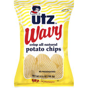
With a constructive critique approach, we would say the Utz logo is charming and historic. The Wavy line drawing is appropriate. The colors are bold and bright, but oddly, they are not flavor colored, they just have random colors. Utz must be very confident of their position in the marketplace because all of their own brand bag designs are very dated and border on inappropriate for a modern market.
.
Crunch
These Chips had a similar thickness to the Regular Chips. So, the addition of the wide Ripples provided a wider Chip to crunch into. And it was an improvement on both the Regular and thinly Rippled versions of this flavor. They broke up crisply, rather than with a pressure-less crash.
Texture
The Ridges on these Chips were wider than the Rippled Chips of the same recipe. They looked more crisp and brittle, but this gave them more character. They were fairly clean and light looking.
.
Taste
Utz have a number of variations of this flavor free Chip. This time, with wide Ridges. We are not in denial, we are aware that our views on plain Chips are not shared by the majority of the Chips buying public. Utz must have some very good sales of their plain Chips for them to turn out different shapes of the same flavor. These have more character as a sandwich partner, but they still taste of oily potato.