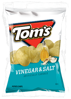
Parent company Lance, have used exactly the same bag design for the Jays Potato Chips range. It is a great use of colors. The white on the top half really makes the giant logo stand out. Although we are not ordinarily fans of huuuge company branding, this works - it works with brand recognition by making it part of the design rather than just plopping a big logo on the bag. The secondary color represents the flavor color coding. The separator image of the bag's contents also works well. We would have preferred a better font or some individualism for the flavor wording.
.
Crunch
These Chips had a light snappy crispy crunch to them. There was nothing hard and robust, as you might find with a Kettle Chip, for example, but the crunch was loud enough, and although a mouthful quickly turned mushy, they were as snappy as any regular Chip.
Texture
These were every day regular Chips. Thinly cut, with oil bubbles and light texture. There was some powder that created a finger residue.
.
Taste
We found it a little odd that Tom's had taken the decision to reverse the most acknowledged name for this flavor, but there you go. What made it even more strange was that while the vast majority of Salt & Vinegar Chips seem a little too heavy and tart on the Vinegar, these were more like a traditional British Chip of this variety. There was a good balance between a mild Vinegar that tasted a little malty and the Salt.