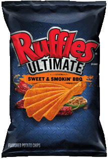
The Ruffles Original flavor bag design is as well known as the brand. The light blue, the positioning of the logo. It all looks so familiar. And bland. It seems odd that a company like FritoLay would have the second biggest brand name in the US, yet do nothing with it. Firstly, Ruffles needs a logo. The lettering may be familiar, but it should be treated like a standalone brand. The two tone blue at the top of the bag should be Wavy; der! The bottom should be larger and flavor color coded. More should be made of the slogan, 'RRRuffles Have Ridges'. But mostly, the new two man teams of the 'Max' flavors and the 'Ultimate' flavors, should be made to feel part of the family. The Hispanic flavors are a small progression in design, but they still feel separate, with just the brand name in common. It is all a bit old-fashioned, disjointed and disparate.
.
Crunch
While Ridged Chips are usually thicker than regular Chips, these huge Waves featured on a slightly thinner Chip than Ruffles usual cut. This did nothing but improve the crunch. There was a crisp smash with every chomp.
Texture
The Ridges on these Chips were extraordinarily wide. It was perhaps no surprise that the bag was not full of complete and whole Chips. The surface of the undulations was not exactly coated in orange powder, but it was definitely present.
.
Taste
A Nose Plunge Test revealed a familiar smoky Barbecue aroma. Chipotle peppers and brown sugar feature on the front of bag image, but were they present? Well, apart from the traditional sweet Barbecue flavoring there was a hint of pepper. Mostly it was a heavy Barbecue flavoring, which was nice - so often, a Barbecue flavor does little to raise taste-buds from their slumber.