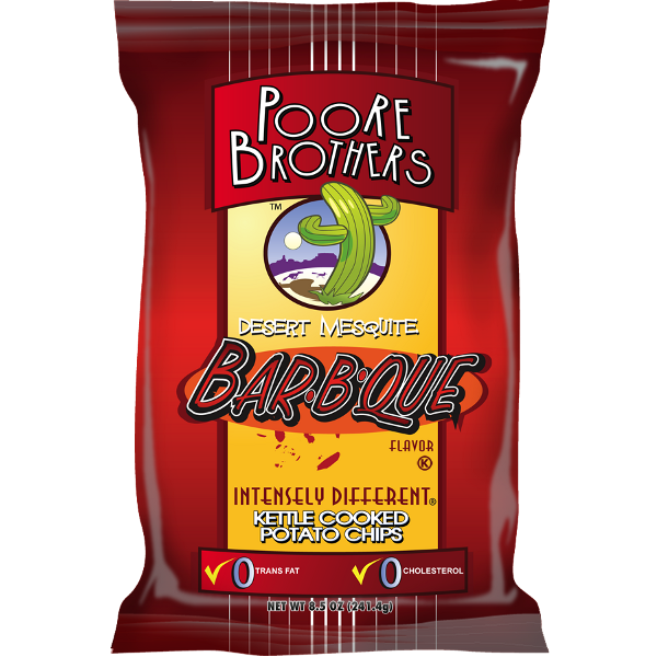
Potato Chips packaging really doesn't get much better than this. It has bright and broad shelf friendly branding and colors. The logo and company name seems friendly and modern. The variety is given due prominence. The 0% 'bad things' is even formed as part of the branding. The different varieties have different colors and this flavor is a dark sort of color which works really well with the creamy yellow of the standardized company branding. We would have preferred the flavor wording was in a lighter color but that is being picky.
Crunch
These Chips seemed crunchier than some of Poore Brothers' Chips. The crispy popping of the vesicles to the snappy brittle breakage of the harder looking Chips, combined well to make an overly crunchy munch worth.
Texture
These Chips almost had a crackling sort of texture. They were shrunken hard and crispy. The oil bubbles festered at different heights. There was visible skin on the edges of a fair few generally curly and folded Chips. There was also some seasoning visible.
Taste
While Poore Brothers have updated their packaging brilliantly, the recipes may not have undergone such a dramatic overhaul. There is still more saturated fat and sodium content in their Chips than a fair few of their rivals. These Kettle Cooked Chips seemed to have a somewhat Smoky Barbecue essence, but they seemed to lack sweetness and had a somewhat burned pepper taste to them.