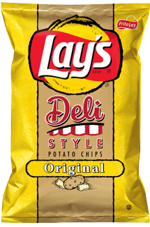
Judging by some of the latest designs from smaller companies, it appears that Lay's are allowed to design for the whole Chips & Crisps industry. As seen with so many, there is a giant logo, a photographic image of a few Chips, and the flavoring or seasoning. The advantage Lay's have over their rivals is of course the most recognisable brand on the market. Even their overseas companies have the same logo, but with their brand name on the red banner. Lay's could actually have a plain, flavor color coded bag with the name of the flavor and their logo, and sell no fewer bags of Chips. However, this is far from innovative packaging. It is actually as basic as it can be while still remaining modern and evocative. Fortunately, not all smaller companies take Lay's lead. It is therefore to them, that we have to look for exciting and interesting bag designs. This is a sort of drawn version of the new designs, but even this manages to lack character or design ambition.
.
Crunch
These Chips were like crispy, snappy Kettle Chips. Not hard and firm like most, but the additional thickness certainly aped the Kettle style rather than the regular style, which can smash up as soon as they are bitten into.
Texture
These Potato Chips were more natural looking and more thickly cut than Lay's standard original Chips. They also looked a little more oil bubbly surfaced, and yellow in color, with visible potato skin. Altogether a more encouraging look and feel to a regular Chip.
.
Taste
The only concern here is whether the taste differs from the standard Original flavor in Lay's stable. Well, it does. Not only is it crunchier, crispier and thicker, as described in the Texture and Crunch sections, but these Chips seemed a little more hearty and warm, fluffy potato to us. Of course, a plain Chip's best serving suggestion is as an accompaniment to an all singing all dancing sandwich, but at least it had a bit about it, unlike the vast majority of flavor-free plain Chips.