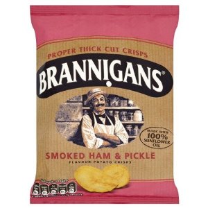
The Brannigans bag has a traditional look and feel, which was the aim when it was designed. The logo is very dull and dated (it should look like a vintage shop sign). The image of Mr Brannigan, a jovial and moustachioed retailer is good and the bags are flavour colour coded. We don't know why KP didn't add an apostrophe in the name, but maybe now that European owners Intersnack have taken the brand on, they might add it! On the other hand they may discontinue the brand before the design gets a much needed update. 3
0
Crunch
There was an odd Crunch to these Crisps. They were thickly cut so there was a biscuity sort of munch, but after a couple of bites it turned into a more familiar brittle crunch. Most familiar of all - it turned to mush towards the end. 3
Texture
These Crisps were among the thickest we have come across. They were therefore relatively flat and there were not many oil blisters either. The colouring was a darkish yellow with a touch of orange and a plentiful supply of powdery seasoning. 3
0
Taste
A Nose Plunge Test revealed a sweet sort of aroma that stung the nose slightly; this is likely to have been the Pickle effect. There was a similarly sweet taste. This provoked imagery of glazed Ham. The overall taste was certainly tangy, like Pickle, but not a Pickle that was recognisable. Perhaps it was a little like a sweet Chutney. I would like to say there was a background of Ham or Bacon, but we couldn't really find it. 3